
NOTIFICATION &
MESSAGING STRATEGY
Bringing clarity, consistency, and relevance to credit and financial messaging.
PROJECT OVERVIEW
Tools:
Tableau Dashboards
Figma
FigJam
My Role: Lead Designer
Team:
1 Designer
1 Product Manager
Design systems team
Timeline: 3 months / 1 Quarter
The Challenge: Building a from-scratch notification and messaging strategy for the existing Experian SaaS offering. Experian's consumer product had too many alerts and messages in the customer experience, and there was no clear strategy on when, how, and why notifications were sent.
The Outcome: Established a unified messaging framework by reworking all existing communication platforms and tools, and creating comprehensive design system guidelines that define how, when, and why to notify users—both within the app and through external channels.

THE PROCESS
NOTIFICATION & MESSAGING STRATEGY
RESEARCH & DISCOVERY
UNDERSTANDING THE PROBLEM
We began by compiling existing research, analyzing customer feedback, and conducting in-depth interviews with members to understand their perceptions of the current experience and messaging. Users consistently reported feeling overwhelmed by the volume of communications—from credit cards to personal loans to report updates—making it difficult to prioritize what required immediate attention. Our existing alert system lacked a sense of hierarchy or standardized components for in-app messaging. While we initially aimed to redesign from the ground up, we needed to work within existing design system components and color tokens, and exclude marketing communications from this first iteration.
KEY INSIGHTS
“You email way too frequently. 2, 3, sometimes 4 times a day is bombardment, and the important messages get lost in the mess."
“Too many alerts. No need for monthly alerts on credit score changes. Only need alerts if something negative appears."
"Quit sending me alerts,
I don't care about every little change I want it to be like it was that I find the alerts when I sign on. I do not want any emails!!!!!"
User Feedback Summary: Users hate how many emails we send, but also want to receive emails that help them.
NOTIFICATION & MESSAGING STRATEGY
IDEATION & EXPLORATION
EXPLORING SOLUTIONS
To solve the problem, we interviewed product managers and designers across the organization to understand how messaging was currently designed, what components were missing, when and why custom solutions were being created, and how decisions were made about sending alerts via push or email.
Our design principles centered on consistency and clarity—ensuring users could quickly identify what mattered most, especially when alerts might signal critical issues like identity theft or unauthorized transactions. Collaboration with stakeholders, particularly my product manager, was key to aligning on technical constraints, business needs, and the rationale behind the existing system’s structure.
NOTIFICATION & MESSAGING STRATEGY
DESIGN & REFINEMENT
CRAFTING THE SOLUTION
The solution involved three key strategic components:
The Strategy: Type, Sentiment and Attention Level Categorized over 200+ notifications by type and attention needed from the user. Every message and alert is categorized by attention level (high, medium, low) and sentiment/type. For example, an alert about possible identity theft would be a high attention, negative alert.
When and How Do We Send a Notification? Created a decision tree to help product teams understand how to send any given message they need to share with the user based on the type of message, urgency, and method of messaging.
Content Guidelines Streamlined alert content down to what the user really needs to know.
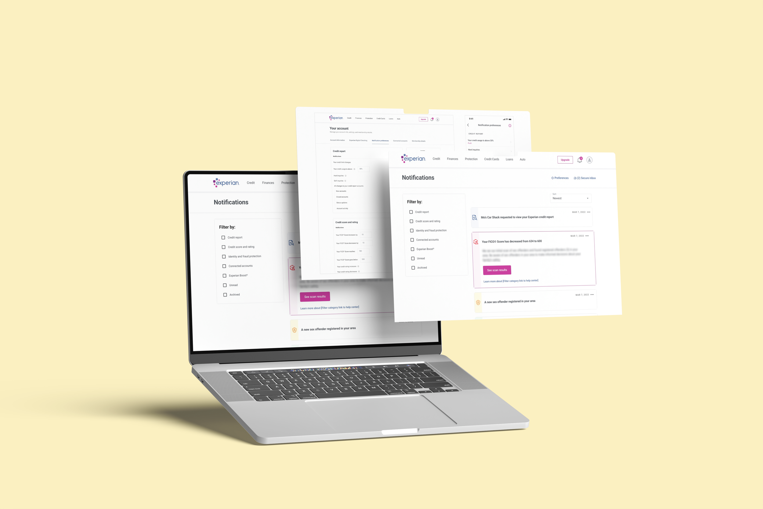
Notification Hub Updated in-product notifications to reflect new guidelines and provide a consolidated location for all messages.
Preferences A critical piece of a successful notification experience is allowing users to tell us what they do and do not want to receive. The past notification preferences experience had only 6 choices, and the choices were different between web and native.


NOTIFICATION & MESSAGING STRATEGY
TESTING & VALIDATION
We used A/B testing to compare new alert styles and the redesigned alert center against existing versions. The results showed that the new system was clearer, easier to scan, and added value across all alert types—not just urgent ones.
Based on user feedback, we iteratively refined the experience, improving how alerts are sorted and filtered, and updating color and icon systems to better convey urgency.
Success was measured through a gradual rollout (1%, 5%, then 25% of users), confirming that the new system maintained or improved revenue and engagement while helping users navigate their credit more effectively.
VALIDATING OUR APPROACH
IMPACT & RESULTS
NOTIFICATION & MESSAGING STRATEGY
MEASURING SUCCESS
This work improved users’ ability to quickly understand and act on alerts, making their experience more intuitive and efficient.
For the business, it established clear guidance on how to communicate with users, resulting in a consistent, scalable approach that is now a key reference within the design system for future experiences.
Additionally, the project revealed the need to expand the framework over time, leading to the introduction of a new alert category for “new” items and offerings.
34% higher engagement on new alerts with less content
14% increase in revenue from notifications
5% decrease in calls to the help center about alerts and notifications
